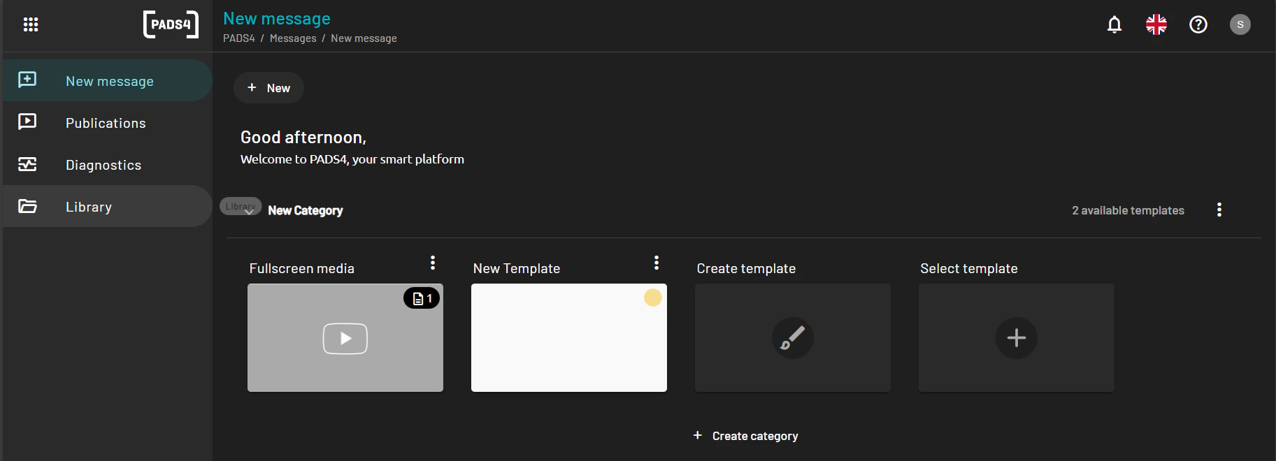
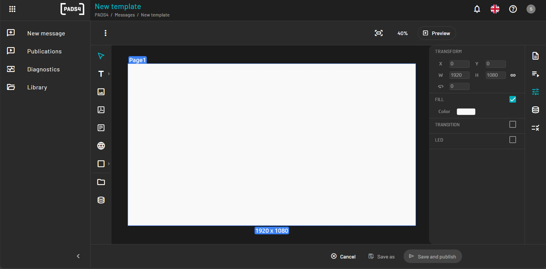
Interface Overview
Once inside the Web Designer, the interface is divided into key areas:-
Canvas Area: The main design space where you place and arrange elements.
-
Toolbar: Provides access to drawing tools, media insertion, alignment, and layer management.

-
Property Panel: Located on the right, it displays configuration options for the selected element (e.g., size, color, alignment).

-
Layer Panel: Lists all objects on the template, allowing you to reorder, group, or delete elements.

Enlarge the Main Page
To zoom or maximize the workspace:-
Use the zoom slider or zoom icons located at the bottom-right of the canvas.

- You can also press Ctrl + Scroll on your mouse to zoom in and out.
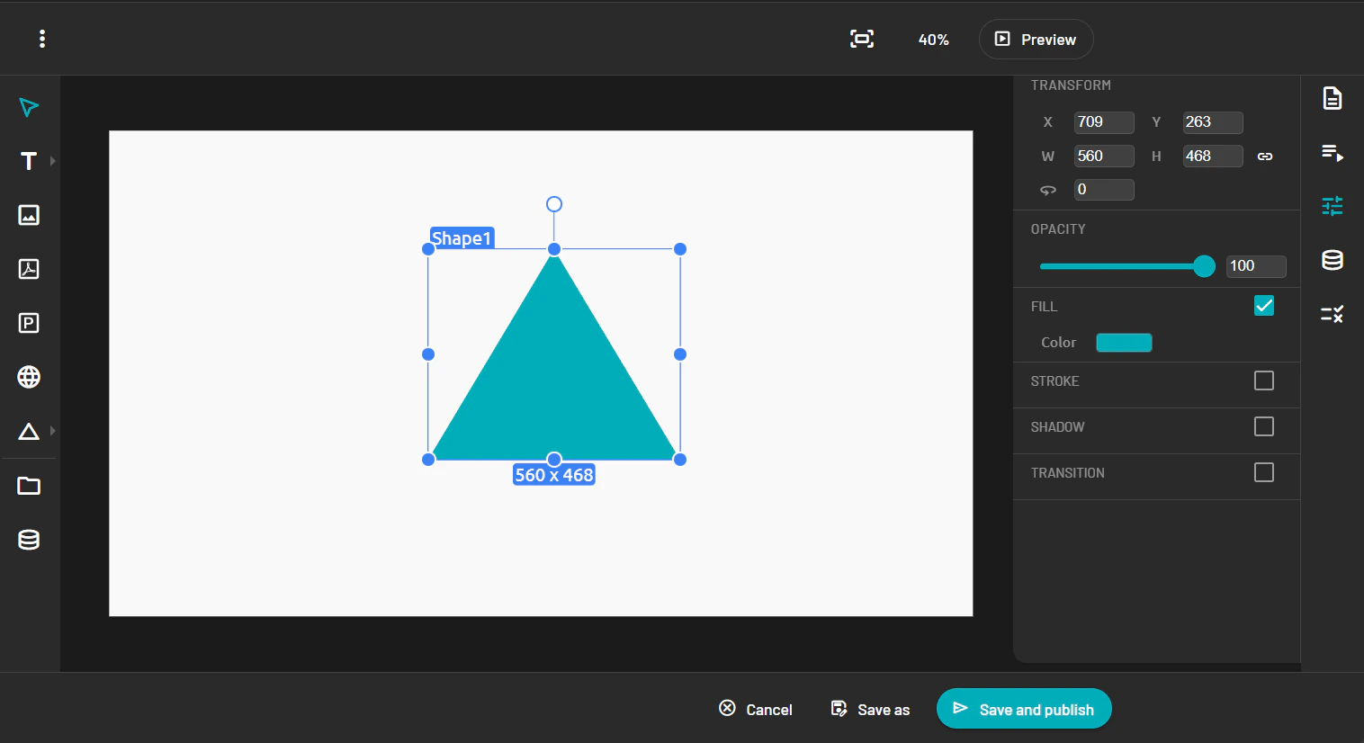
Add a Shape
-
From the toolbar, select the Shape tool.

- Choose a shape type (e.g., rectangle, circle).
- Click and drag on the canvas to draw the shape.
-
Use the Property Panel to customize its color, size, border, and position.
Add an Image / video
- Select the Image tool from the toolbar.
- Click on the canvas to place the image block.
-
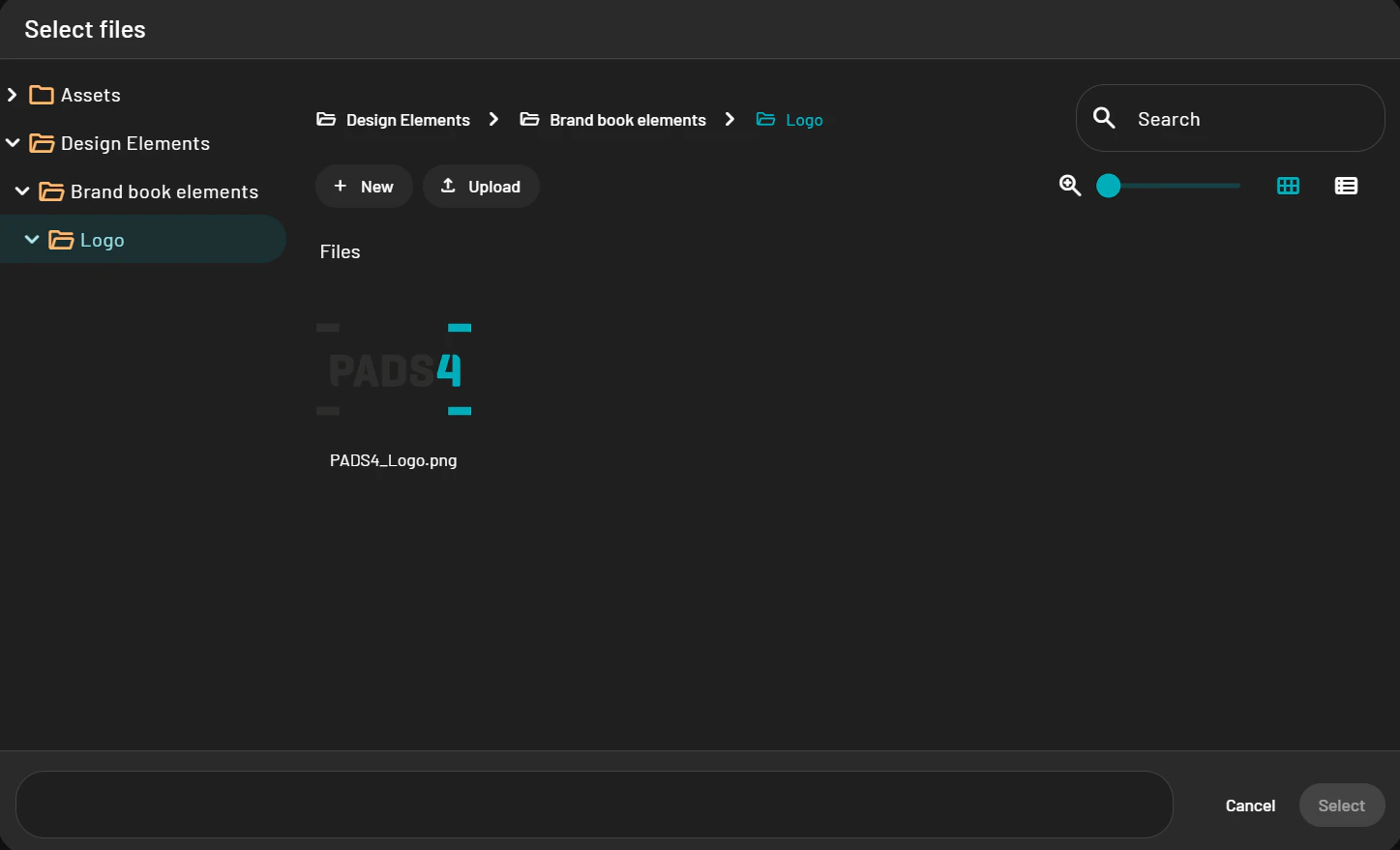
In the Property Panel you will have three options: 4. Empty item: If you want the end user to add the content and you just provide the element itself. 4. Content item: You select the content from the content library. External item: Image or video hosted somwhere else.
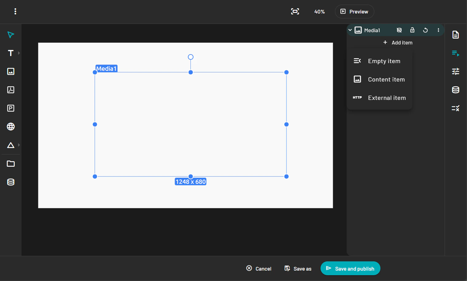
-
When using content item an pop-up of your PADS4 content library will show up and allows you to pick the media you want.
- Resize and position the image as needed.
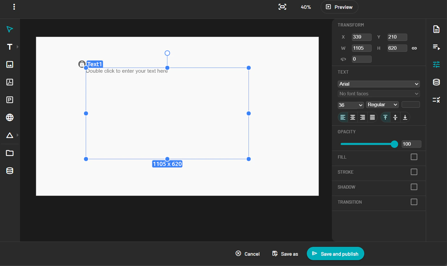
Add Text
-
Click the Text tool in the toolbar and choose a regular text field or a date & time element.

- Click on the canvas to create a text box.
- Type your desired text.
-
In the Property Panel, adjust the font, size, color, alignment, and effects.
Save Your Template
When your layout is complete:-
Click the Save button in the top toolbar.

- Your template will be saved and become available under the Templates section.
-
It can now be used as a base for creating messages.